
Derive VQ Installer
Background
In my first meeting with the product manager for VQ Installer it was revealed that the Comcast project was quickly falling behind schedule. Installations were taking longer than expected and install technicians were frequently calling customer support with issues related to the app.
In collaboration with the dev team, the install teams, and customer support staff, I kicked off a high-stakes overhaul of the VQ Installer app aimed at improving stability and streamlining the installation process. By the project's successful conclusion, we'd re-established trust with Derive's largest customer, increased payouts for install technicians, and demonstrated the advantages of a research-based approach.
Company
Customer
Team
Contributions
Project Duration
Process Overview
Putting The App In Context
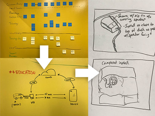
This process helped clarify some of the reasons install technicians were experiencing issues, e.g., shortcuts and quick-fixes that had been implemented during the product's hasty development. Identifying and documenting these technical details gave me a better sense of what to watch for when observing the install process first-hand.
Boots on the Ground
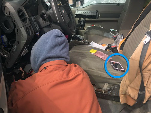
What I discovered about the app from these visits was that, when something went wrong (or right, for that matter), the communication from the app was confusing and seemingly inconsistent. Sometimes closing and reopening the app would clear an error. Other times, taking the same action would produce a different error. This created an almost superstitious mistrust of the app that frequently triggered calls to customer support and often required direct interventions from the dev team.
Establishing Goals
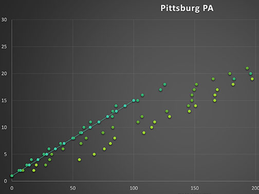
A secondary goal of the project was to decrease or eliminate the number of calls placed by install technicians to customer support. This required me to keep in close contact with the support team and gain access to their online support tools.
It was also important to me that we gauge general satisfaction with using the app. For this I kept in close communication with the install team leads, checking in whenever significant updates were made and continuing to make and document site visits whenever possible.
Prototype, Test, Rinse, Repeat
Problems
Below are the primary issues and associated questions that my team addressed in order of priority. We prioritized issues in this way because it made the most sense from the mobile developer's perspective and the team agreed that, by fixing the first two issues, we'd be better set up to respond to the needs of install technicians moving forward.
1. Lack of Transparency
"What the heck is the app doing?"
When the app was working, it did provide some feedback but it came in the form of a meaningless loader and text that quickly flashed across the screen before disappearing. Technicians found this experience frustrating and it diminished trust in the app.
2. Error Handling
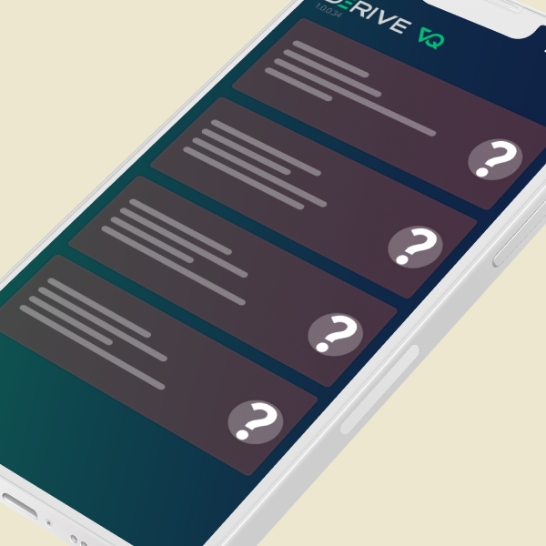
"What does that even mean!?"
As is often the case, the app's error messages were seemingly not intended for human consumption. This was especially problematic given the range and likelihood of errors that could occur when dealing with bluetooth, wifi, LTE, humans, AND a motor vehicle.
3. Device Identification
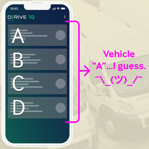
"Am I connecting to the correct vehicle?"
The main screen of the app displayed a list of nearby VQ devices. In a crowded parking lot, it wasn't always obvious which device was correct. There was also a general lack of detail provided in the list.
4. Refreshing
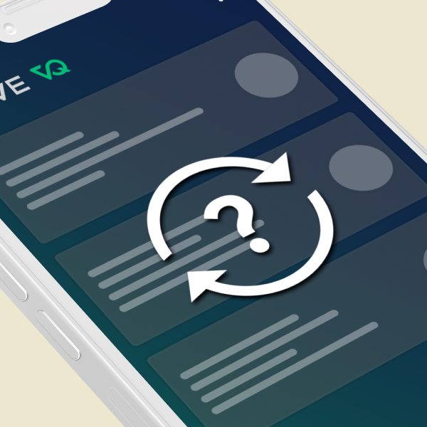
"Pull down to what now?"
For many, pulling down on a mobile screen to refresh a list feels like second nature. But, if that's not a gesture you're familiar with and refreshing is necessary to complete some tasks in your app, the refresh mechanism should be very discoverable. Add to this the complication that refreshing can sometimes be disruptive or technically expensive, i.e., using more data or power than necessary, then you'd better be very careful about how it's implemented.
Solutions
1. Lack of Transparency
Solution: Better categorization of data + subtle animation
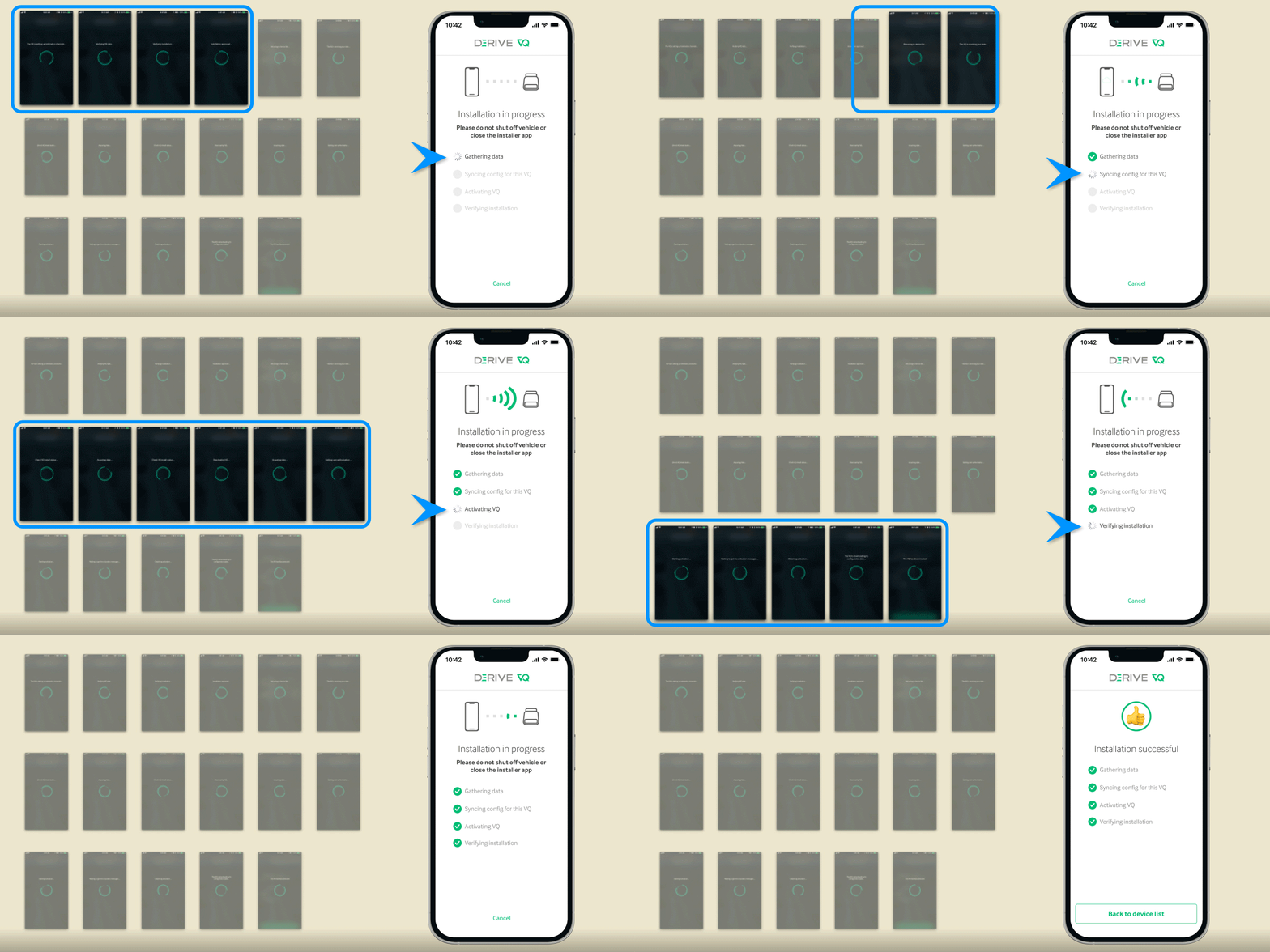
The previous app experience during VQ installations presented technicians with a flurry of messages, some only lasting a fraction of a second. I collaborated with the mobile dev and firmware engineers to decipher what was happening during this process and essentially translate what all these messages meant. We organized the different messages into categories based on things like the type of communication occurring, e.g., VQ-to-cloud vs. phone-to-cloud, and, most importantly, points of failure. This turned out to be crucial for solving the issue of poor error messaging (see section two below).
I'll admit that it wasn't immediately clear to me why technicians frequently complained about this part of the experience, even when no errors occurred. After all, the app was clearly doing something during this process, and what did they care what was going on in the background? It wasn't until speaking with them directly that I realized what they were looking for was a sense of empowerment. Given all of the potential things that could go wrong in this process, they wanted to know exactly what the app was doing during each step so they could take action as soon as possible.
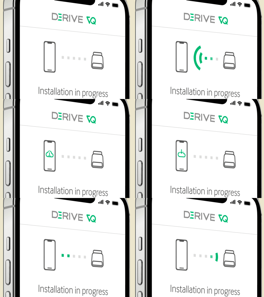
Clarifying Status With Animation
An important part of this solution was the inclusion of animations to indicate the flow of data. By displaying icons of the phone and VQ device on the install progress screen, I was able to indicate exactly what type of communication was occurring during each step. This was especially well received by install technicians because it allowed them to quickly identify what was happening and respond if needed—finding better cell coverage for cloud-to-phone events, for example.
The mobile dev and I went through a long series of trial and error to get these animations just right. At first we tried animated GIFs but the file sizes were too large and the quality was not great. We also considered using small videos but that turned out to be impractical. The solution we arrived at was Airbnb's Lottie. I created the high-framerate animations in Adobe After Effects and handed off the tiny Lottie files (~12k per file 😎) to the developer who was able to quickly install the library in Xcode.
2. Error Handling
Solution: Removing dead ends by making errors actionable
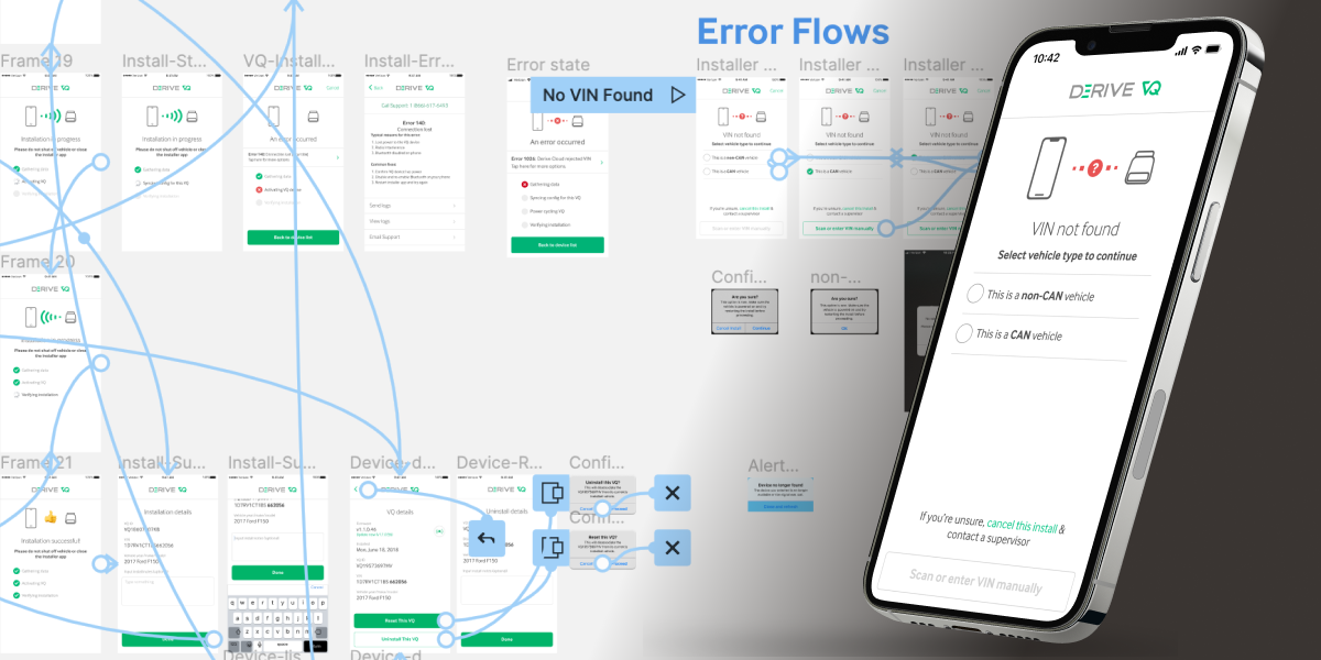
There was a frustratingly large variety of reasons a VQ installation could fail, and the initial implementation of error messaging gave technicians little to no insight. By collaborating with VQ customer support, the dev team, and install technicians, I created an inventory of the different failure states for the app and incorporated appropriate solutions—either through improved copy, or by branching the app into further actions that install technicians could perform.
One example of a frequently encountered error occurred when a VQ was plugged in and failed to identify a vehicle identification number (VIN). This typically happened on older-model vehicles and required install technicians to call customer support to have the VQ and VIN associated in the database manually. I collaborated with the database team and others to incorporate these extra steps into the app, allowing the install technicians to complete any installation without external help.
Making the VQ Sing 🔊
The app already had an audio-locate feature: tapping a device in the list made that VQ beep so a technician could confirm they had the right one. It saw little use because the control was not discoverable and its tap target was small. I made the control visible without explanation, enlarged the target, and confirmed the change in testing with install technicians.
3. Device Identification
Solution: Sprinkle in some beeps, boops, and context
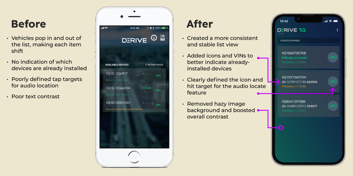
One of the first problems that I observed in the original version of the app was how difficult it could be to identify and select the correct device. There was an audio locate feature for confirming the correct VQ by making it beep, but the feature was not super discoverable and the tap target for the button was quite small. There was also no way to discern a previously installed VQ from one that was ready to install. I generally cleaned up the UI and thoroughly tested the results to confirm everything had improved.
Another element that I pushed for in this solution but was unable to get included were vehicle photos. I had a hunch that including an image of each vehicle could go a long way toward making visual recognition faster and more seamless. I confirmed this by including vehicle images in prototypes and clocking the improved recognition times. Ultimately, the idea of including images was abandoned for performance reasons, but the research turned out to be invaluable for a subsequent project (see Epilogue below).
4. Refreshing
Solution: Persistent feedback
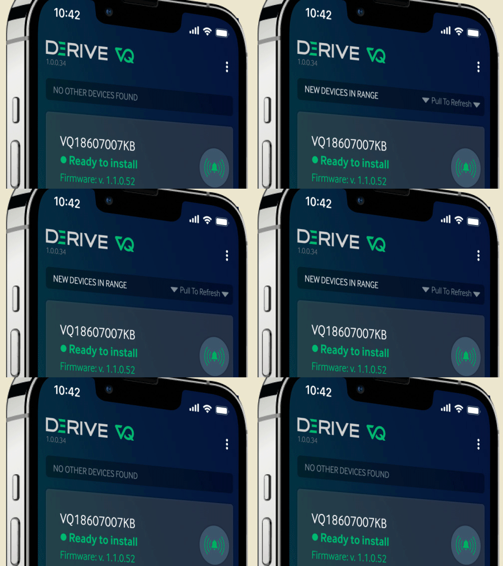
An often requested feature that wasn't in the app's initial version was the ability to refresh the device list. Without this feature, early versions of the app refreshed automatically, causing disruptive shifting of the list and unwanted taps.
When I recommended adding pull-to-refresh, the mobile dev suggested that it might be too advanced of a gesture to include for our audience. I initially balked at this suggestion, then I setup interviews with installers and confirmed that the dev was correct—pull-to-refresh was not necessarily a ubiquitous or discoverable gesture for all those using the app.
The compromise solution that we implemented turned out to be beneficial in two ways: it leveraged the pleasantly smooth experience of pull-to-refresh while providing a clear and persistent indicator of when refreshing might be necessary. This last point was important because refreshing the list was not a trivial action—it measurably increased battery drain for both the phone and vehicle by forcing greater bluetooth activity.
Conclusion
By almost every measure, the VQ Installer project was a success. The end result of the above solutions was that install technicians could complete their work and get paid faster, without outside help in almost every case, and Derive was able to honor its ambitious commitments to Comcast. This project also set a benchmark for a design-led, research-based approach at Derive.
Business Impact
- Markedly improved customer relations with Comcast according to Sales and executive leadership
- 23% improvement in install times as measured by firmware analytics tools
- 90% decrease in install-related customer support calls as measured by support ticketing software
- Significantly improved install technician's job satisfaction as measured by regular checkins following app updates and releases
Epilogue
Transitioning To A More Versatile Experience
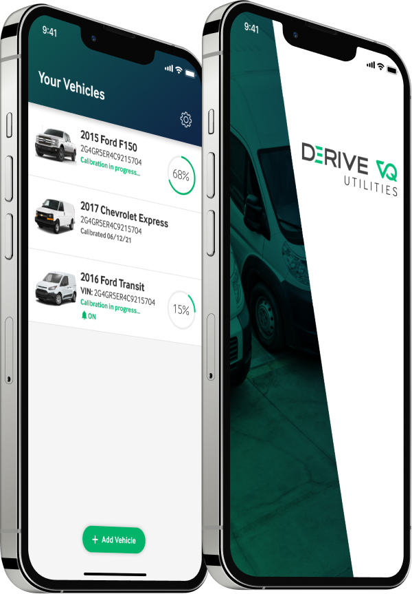
Early in my work on the VQ Installer app, I began hearing ideas and suggestions from throughout the organization about other features that, given Derive's product roadmap and the nature of the VQ itself, would eventually need to be incorporated into an app. According to the mobile dev team, the Installer app itself was not an ideal place to incorporate these features, so I collaborated with the Installer app's product manager to document, sketch, and prototype what this more robust application might look like. Thus the VQ Utilities app was born.
Rather than focusing on the VQ itself, the Utilities app was a much more vehicle-centric application. By simply scanning a vehicle's VIN, the app could unlock a range of options for managing, monitoring, and upgrading various features of the vehicle including improved fuel efficiency and added safety. This application became one of the primary projects of the mobile dev team and was still in Alpha when I left Derive in January 2022.